The story behind our rebranding:
Arab Union Glass, a company with a proud history, underwent a rebranding to embrace sustainability and global standards. We wanted to showcase our values internally and externally, emphasizing transparency and professionalism in the industry.
By unlocking potentials for sustainability and meeting global standards, Arab Union Glass positioned itself as a symbol of excellence while preserving our enduring legacy.
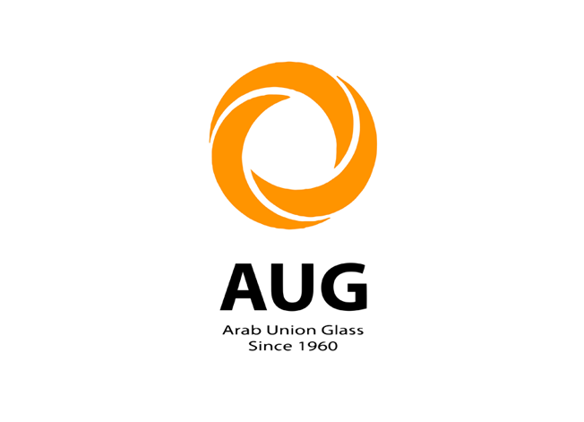
Our new logo reflects modernity and development, designed in line with contemporary logo shapes, emphasizing simplicity and clarity. It consists of a collection of sharp and precise geometric shapes resembling glass, symbolizing accuracy and craftsmanship in manufacturing. The blue color has been chosen to represent purity and clarity, reflecting the essence of glass production.
Finally, our tagline “Development Reflecting Mastery” embodies our reliance on innovative solutions in the glass industry. Through the development of new technologies, products, and applications, we aim to offer world-class products that reflect our expertise and excellence.
Before
After